

We took to Facebook LIVE with the brand new CND ICONIC Collection. You can check out the live video by scrolling to the foot of this page or click the link and head on over to watch with the comments as they came in live. CND ICONIC LIVE – with Fee Wallace
This collection is available for a limited time only! If you are in the UK or Ireland, you can get your set exclusively from Sweet Squared. Shop the ICONIC Collection

Colour Comparisons
So many Nail Pro’s have been asking for colour comparison shots to see the colours from this collection up next to similar existing colours in the Shellac range. You will notice that a couple of the colours in particular are not too far away from some of the classic colours we already have. This is not surprising considering that the ICONIC collection shades were chosen because they were the most popular nail colours from back in the day. You can’t argue with a classic, and the kinds of colours loved all those years ago, are still some of our most sought after shades today.
Spike
I’m going to start with my personal favourite from the collection. It is deep and luscious with velvety metallic texture for days. Spike’s closest relatives are are all in the deep wine/bordeaux area of the shade chart.
- Darker than Masquerade
- More plum that Crimson Sash
- Less brown compared to Dark Lava

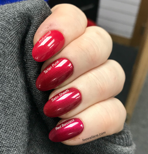
Satin Sheets
This bold, gently metallic red, is a dream to apply. It goes on like heaven. The existing shades closest to Satin Sheets are the super opaque, classic winter reds, though all of them are popular no matter the season.
- Deeper and less warm compared to Hollywood
- Cooler and creamier/less metallic than Tartan Punk
- Warmer and less raspberry compared to Red Baroness
Jiggy
What fabulously quirky colour! Jiggy lives on the border between blue and purple. It has a vibrant ultra violet quality. Simmering, light reflective and very cool.
- More metallic and purple than Blue Eyeshadow
- More vibrant and brightly blue than discontinued shade Purple Purple.
- Much further toward the blues compared to Eternal Midnight

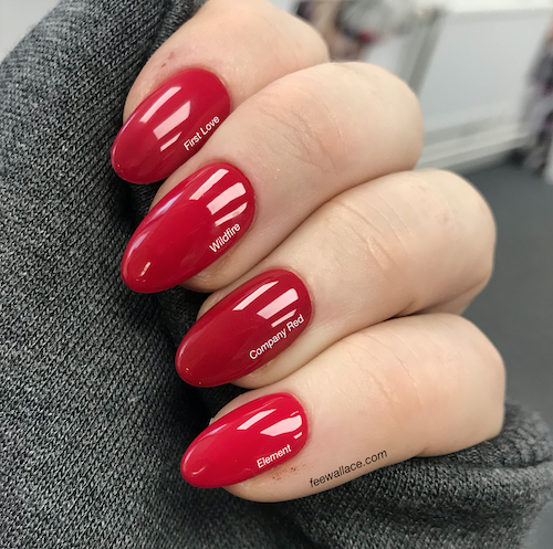
Company Red
The original classic red from Creative Nail Design. Warm, creme, bold, this shade is an obvious icon. Company Red sits nicely amongst our other classic red shades, showing its age only by the slightly warmer pigment blend.
- A hint warmer and deeper than Wildfire
- Darker and less bright compared to Element
- A little deeper and more densely opaque than First Love
Pointe Blanc
Is it white? Is it pink? Pointe Blanc is more white than pink, a shade that can be useful for french manicures and for crisp, clean, full coverage.
- More pink and a little softer than Studio White
- Greater opacity and a bit less pink compared to Romantique
- More opaque, and pinker than White Wedding

Check out or Facebook LIVE packed with classic colour banter from Nicola and I, as well as top tips under camera for that sleek, flawless professional manicure finish. Thanks so much if you were able to join us live! We had a lot of fun.
Thanks so much for checking out the blog! Would love to know what you think of this collection here in the comments, or join in the convo over on Facebook.
See you next time!

Nice shades, I love the reds ❤
LikeLike
Thanks Amanda, me too! Xx
LikeLike